Real Time Prescription Benefits (RTPB)
Role: Lead Researcher and Designer.
Context
Most providers are writing multiple prescriptions on a daily basis. In an effort to get their patient’s the best prescription costs, many providers are spending countless hours looking online for rx coupons. Sometimes provider’s might completely change the medication if its not on formulary. For this feature we partnered with Surescripts to leverage their real time prescription benefits data so we can surface this information to allow providers on our platform to focus on providing quality care.
My Role
– Worked closely with a product manager to do discovery on the feature.
– Helped define and gather requirements.
– Helped define product milestones.
– Conducted user research sessions to learn more about the problem space.
– Conducted usability testing.
– Designed lo-fi and high fi mocks.
– Helped define what metrics we should use amplitude on to gauge success for the product.
Gathering Requirements
The requirement gathering process for the project was unique since we were working with a third party vendor for this feature. We had to parse through Surescripts requirement documentation to identify what data we were getting and would be able to display. As a team we had discussions to find a good balance between what we could get done in a timely manner for MVP, making sure that the data we display will provide value, and also keeping in mind that we have to display certain data in order to pass certification.
Persona
The main persona this feature was being designed for was insurance taking primary care providers.
Although staff users do sometimes create prescriptions the PCP is the person making the clinical decision on what rx would be best suited for the patient.
User flow:
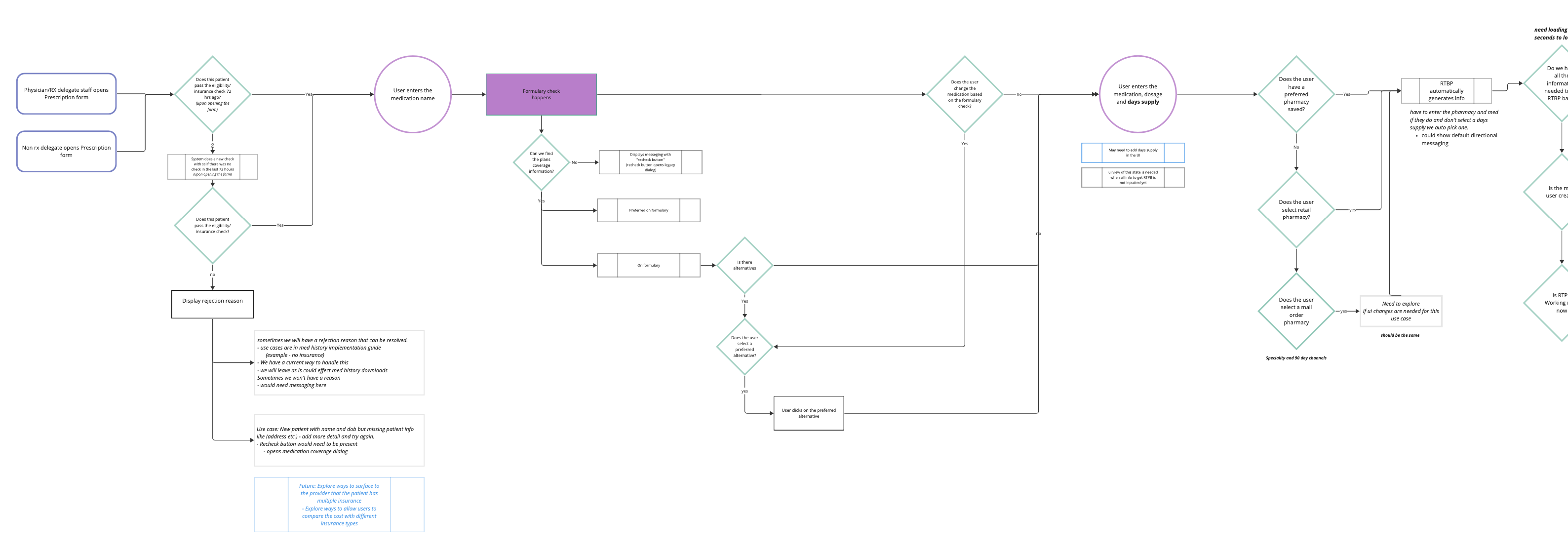
After parsing though Surescripts documentation I was able to to create an initial future flow for how this feature could work. After creating the first iteration I collaborated with both product and engineering to get some questions answered and make sure that we were all aligned for MVP.

Lo-Fi designs
When working on this project I started by doing some lo-fi designs exploring the north star possibilities for this project so I can identify if any of those concepts can help influence the initial designs. I then scaled those designs back to align with our MVP concept. I decided to add this feature to our existing prescription form since providers are making the clinical decisions about the prescription at this point in time.
—
—-
Research:
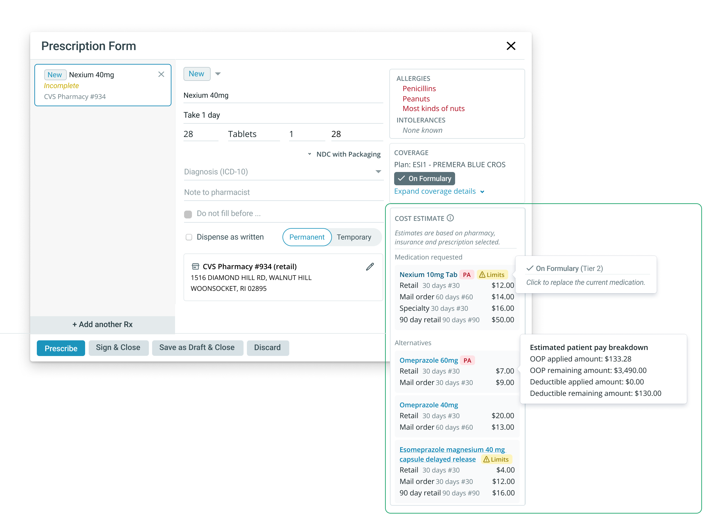
After creating the lo fi deigns, I narrowed down a few different concepts and did several rounds of usability testing with providers to see which designs were the most intuitive. The research included both usability testing and q/a as we tried to get a gauge on how valuable certain information would be for the providers. Some of the information we were planning on displaying included formulary, prior authorization requirements, and cost estimate information.
Findings:
– Direct primary care and fee for service providers didn’t find the information valuable since the cost estimates were based on the patients insurance and they were not insurance taking providers.
– Many providers thought it would be helpful to also display the cash price if possible.
– Providers appreciated the formulary and alternative medication information we were displaying.
Hi-fi designs
Hi- fi wireframes: After several rounds of user testing we were ale to finalize the deigns. A screenshot can be seen below.
