COMPETITIVE ANALYSIS
For the competitive analysis I looked at Resy, Open Table, and AMC. Resy and Open Table are reservations apps but they don’t allow users to select their seating. I choose to examine AMC because although it’s not for restaurants, their service allows users to reserve their seating at a movie theater.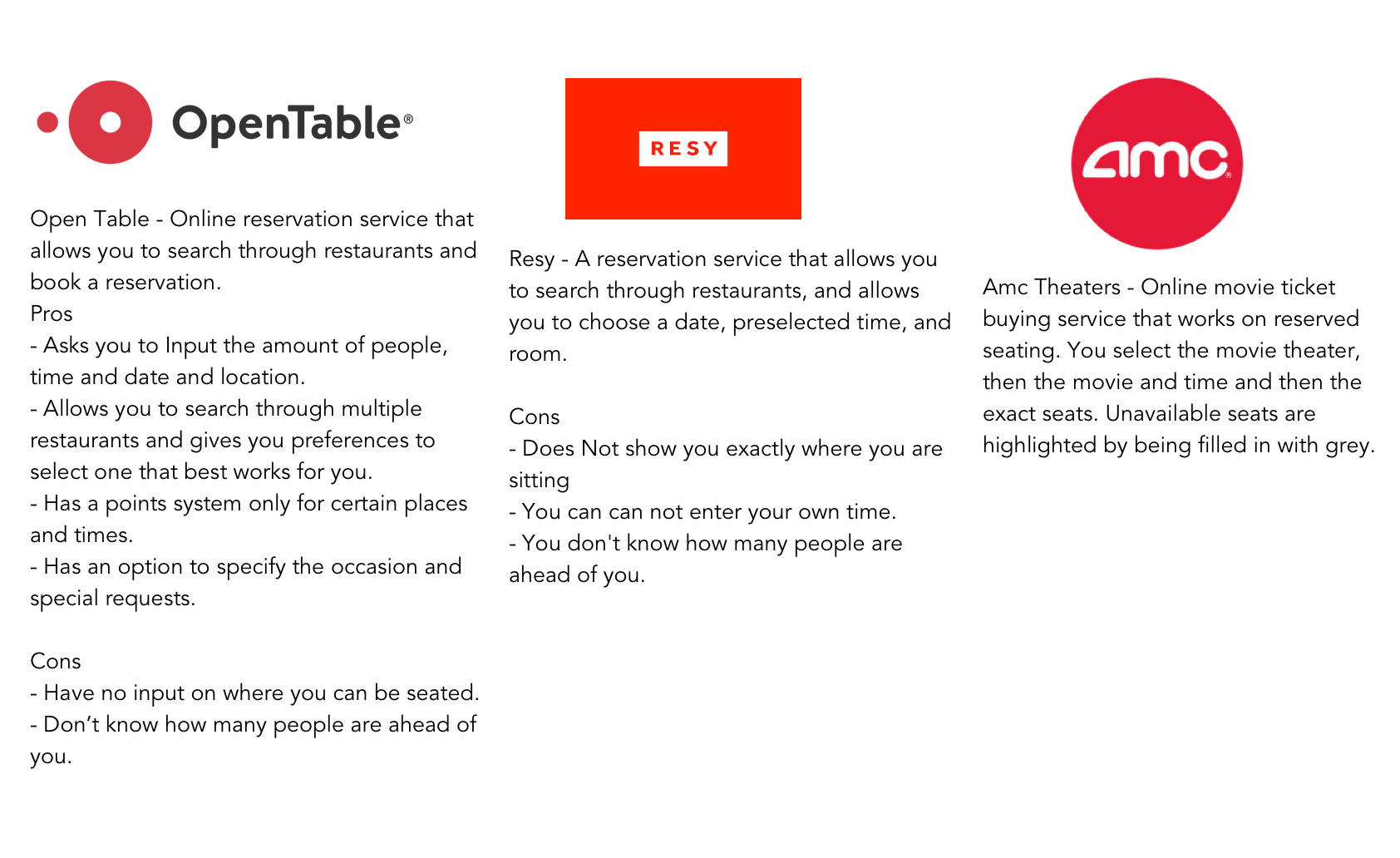
PERSONA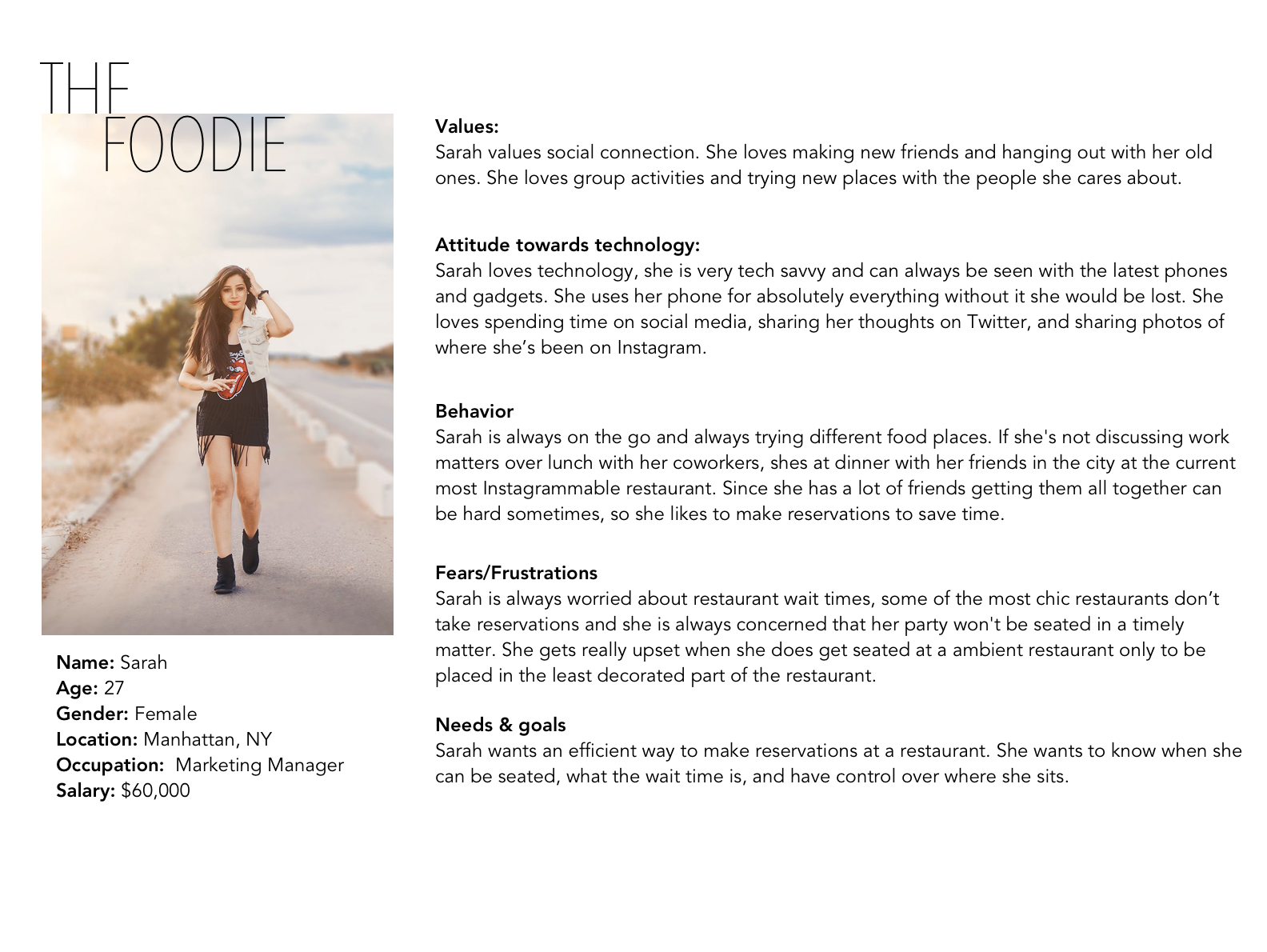
SITEMAP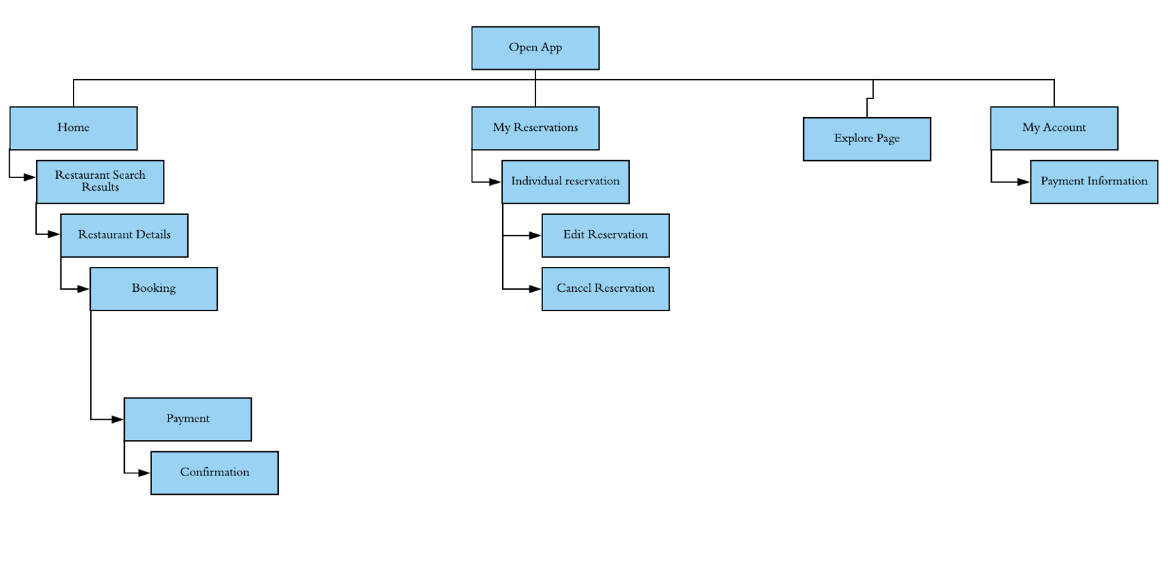
LO- FI WIREFRAMES
I started by creating quick lo – fi wireframes so to create a rough guide to follow.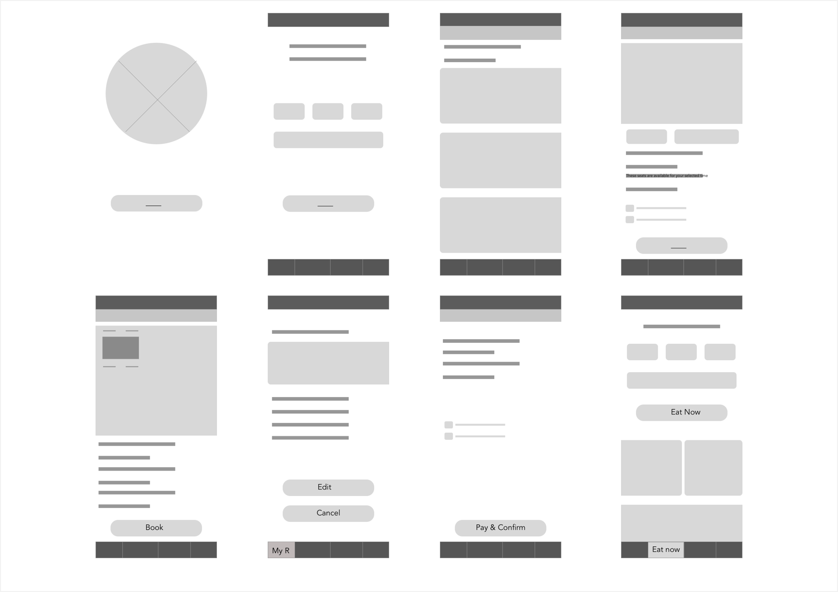
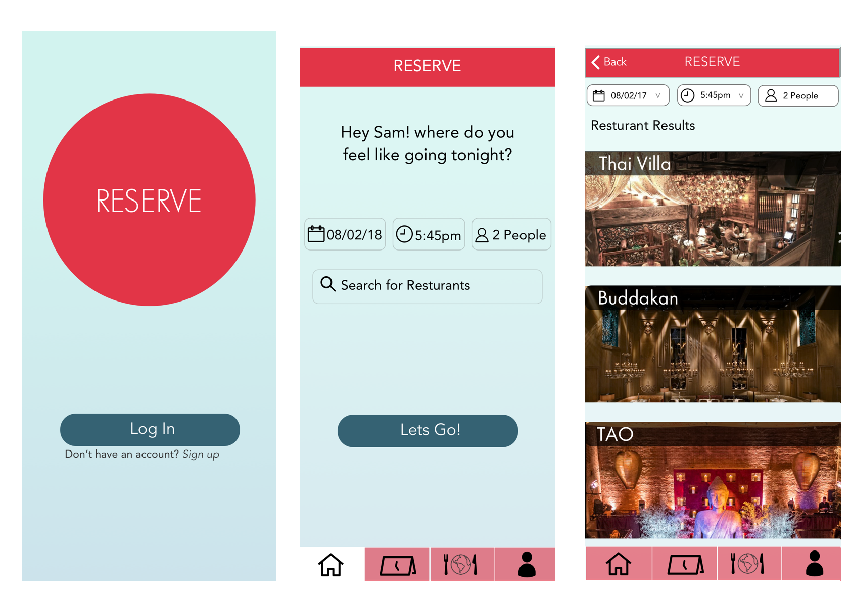
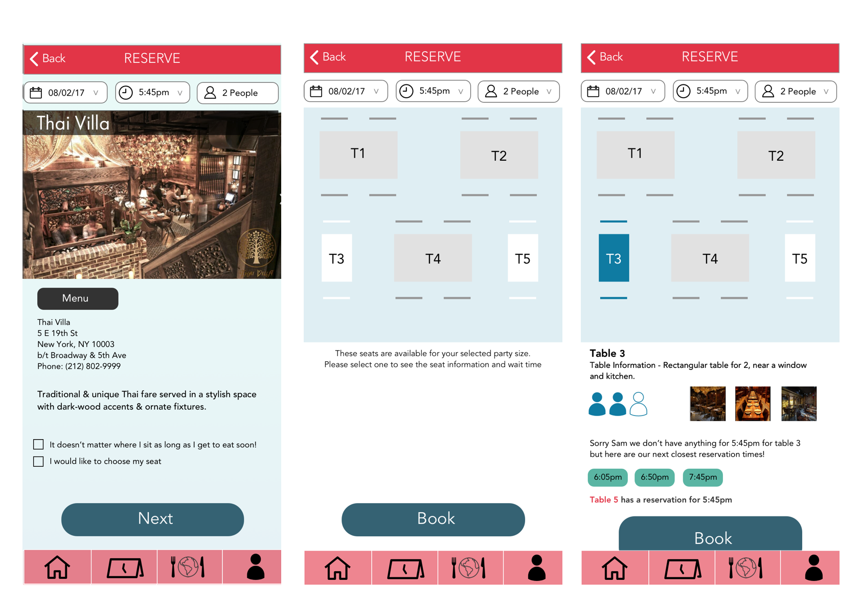
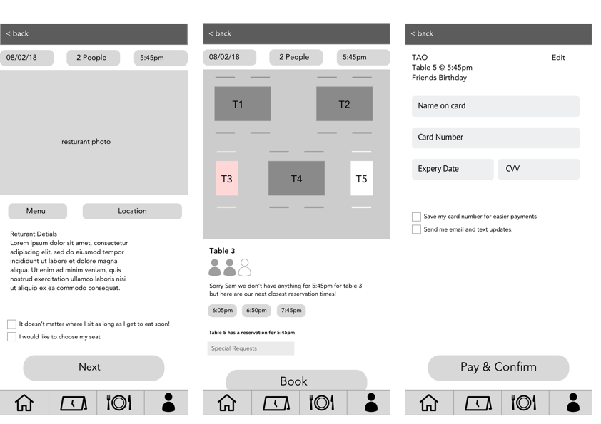
HIGH-FI WIREFRAMES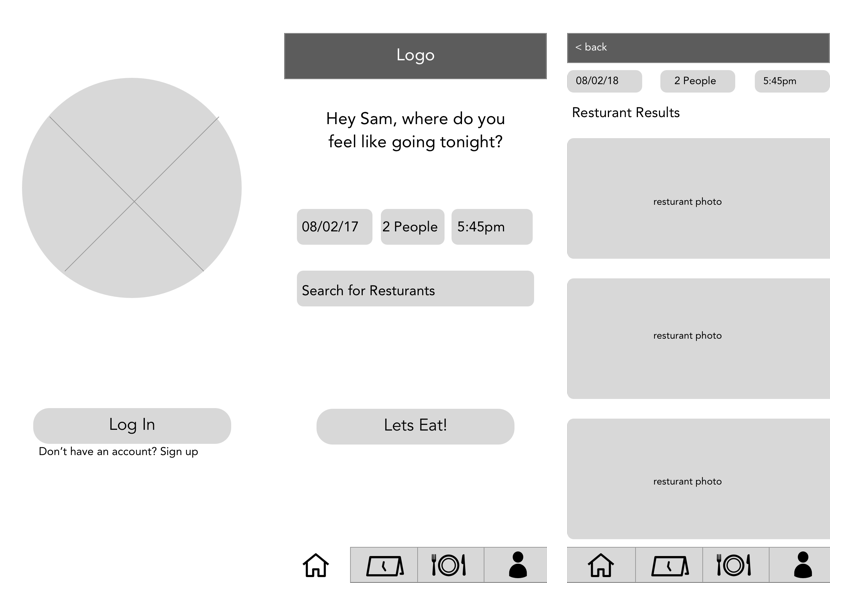
STYLE GUIDE
To design the user interface of the app I created a general style guide. I choose the color scheme based off of the traditional meaning behind colors in advertising the colors are based on the traits that I wanted my brand to represent.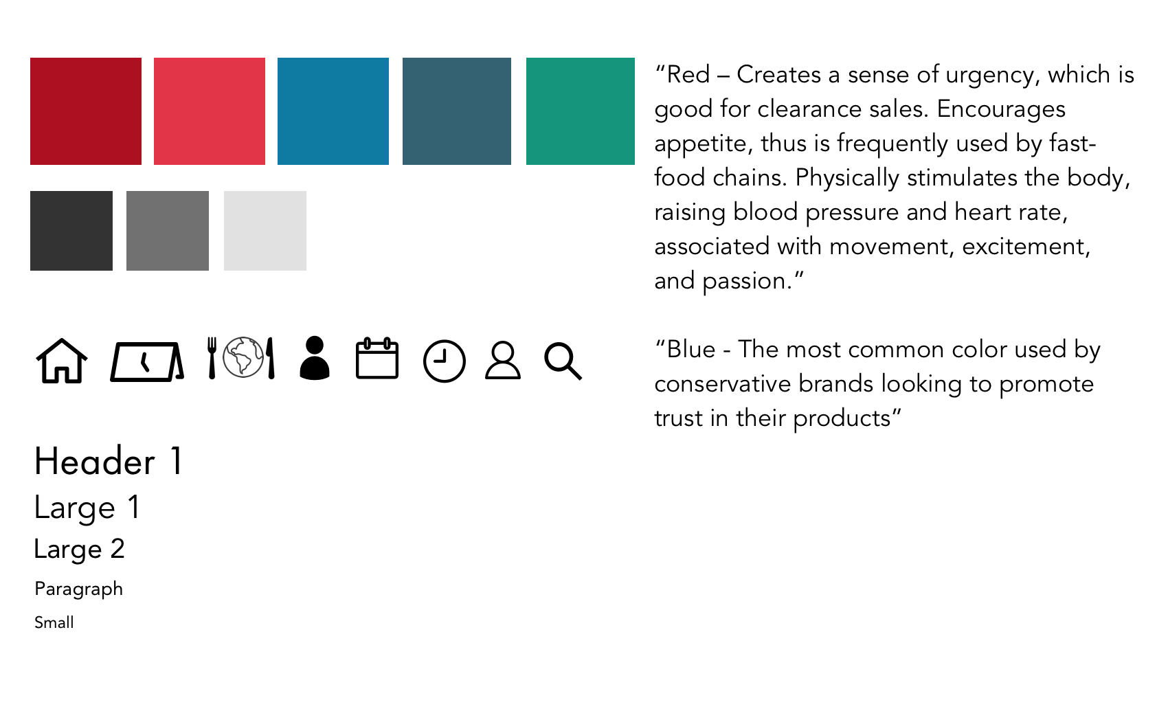
Prototype
After analyzing the feedback received from user testing, I made changes accordingly which can be shown in the final mockups.