RESEARCH:
First I researched to see if there were existing apps and websites with the same concept. After gathering a couple, I looked through them myself and then I observed and noted user’s interactions with the app. I asked user’s to complete a series of tasks within the apps, this was insightful as it helped me see what was effective and what caused confusion.
I also asked the same group of people a couple of questions to learn more about our user’s needs.
1. “Tell me what a typical day after work looks like for you?”
2. “ How valuable is cooking to you? Do you like to spend time doing it or want it done as fast as possible?”
3. “Describe to me what your process is when you find a recipe you want to make”
4. “What is the most frustrating thing about finding a recipe to make for yourself or your family?”
5. “How often do you buy items once for a receipe but don’t use them again ”
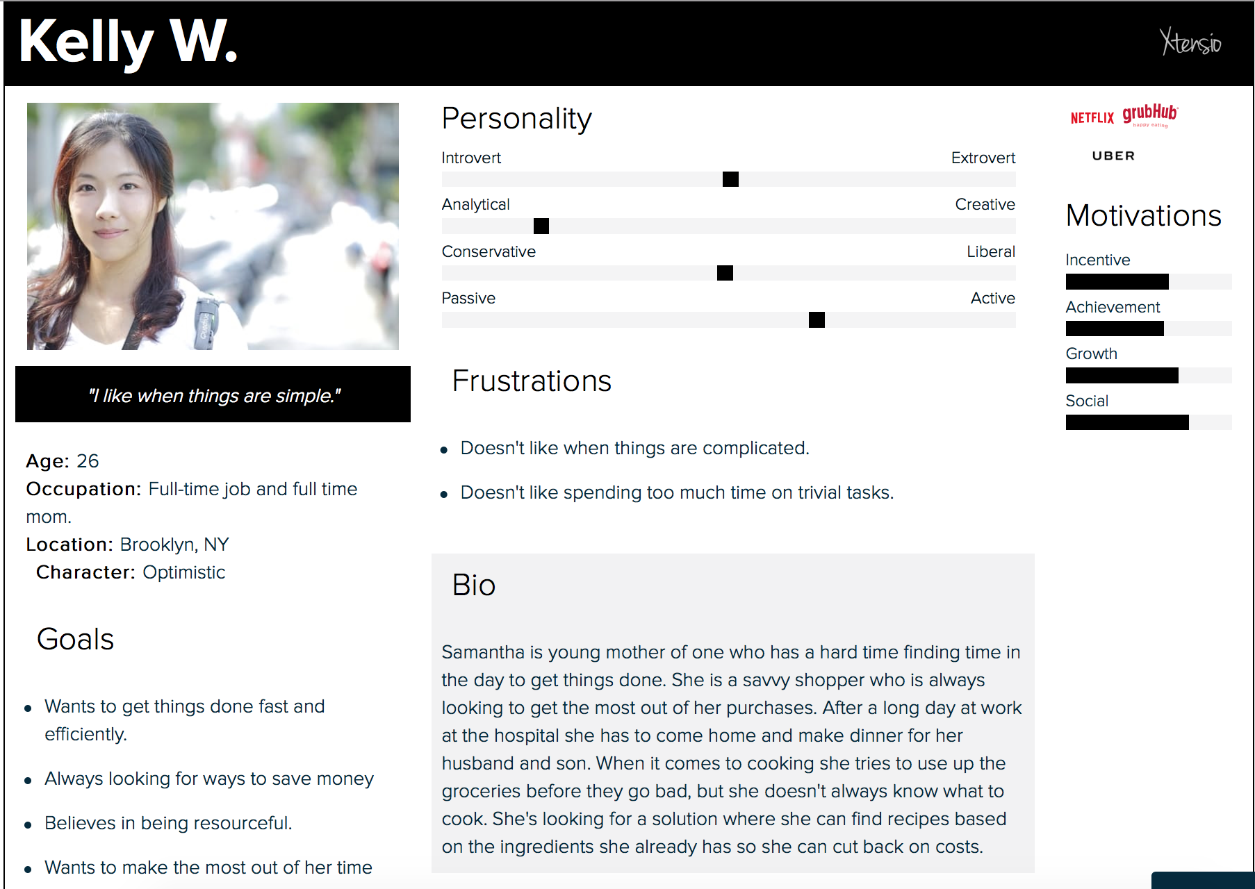
PERSONA:
I created persons to help gain a better grasp of the user’s who would be using the app.
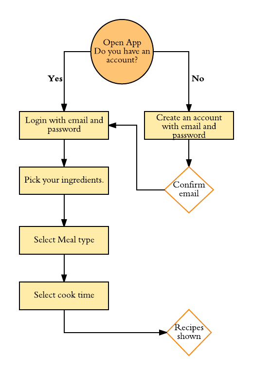
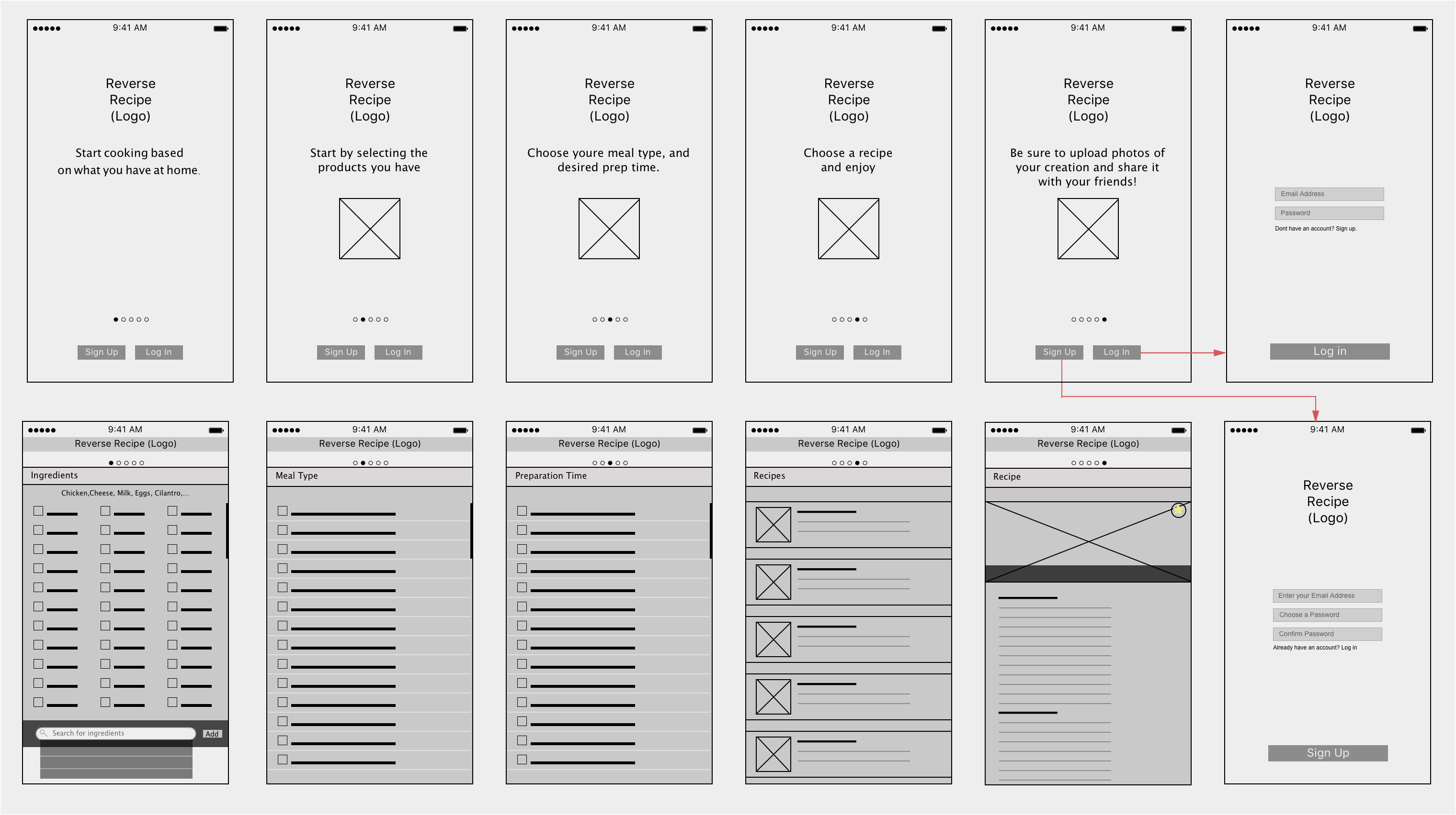
USER FLOW:
Creating user flows to help identify the choices that user’s would need to make in order to effectively find meals to make based on their ingredients, meal and time preference. This small user flow helped to target the main path that users will navigate through. The user flow allowed me to narrow down my focus to a couple of main screens that I would have to focus on while designing wireframes.
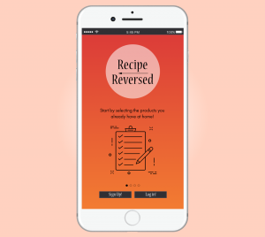
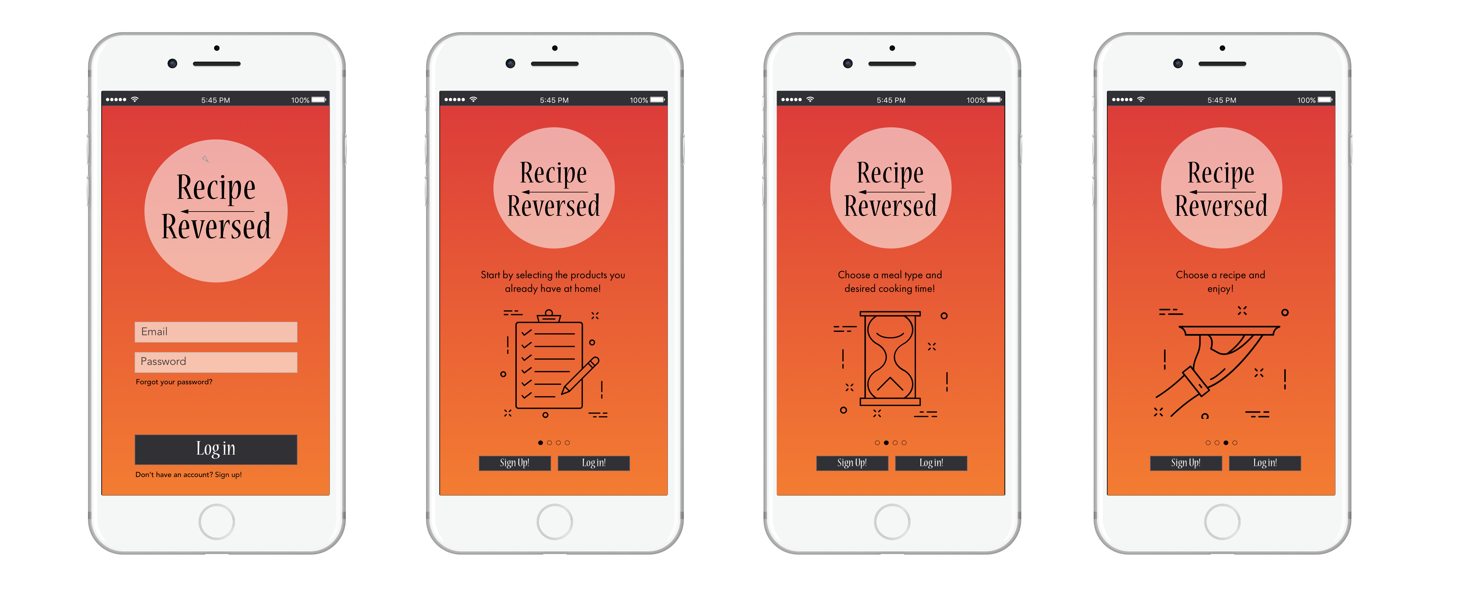
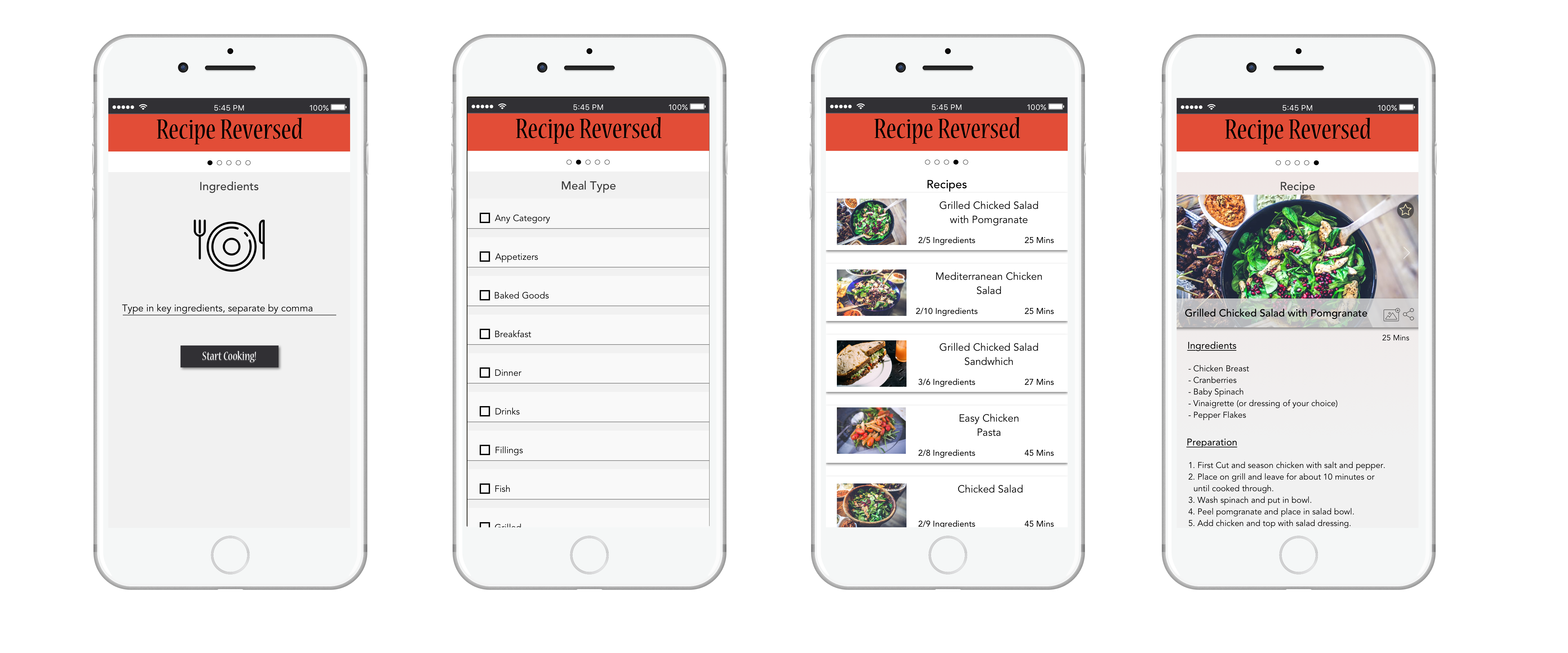
WIREFRAMES:
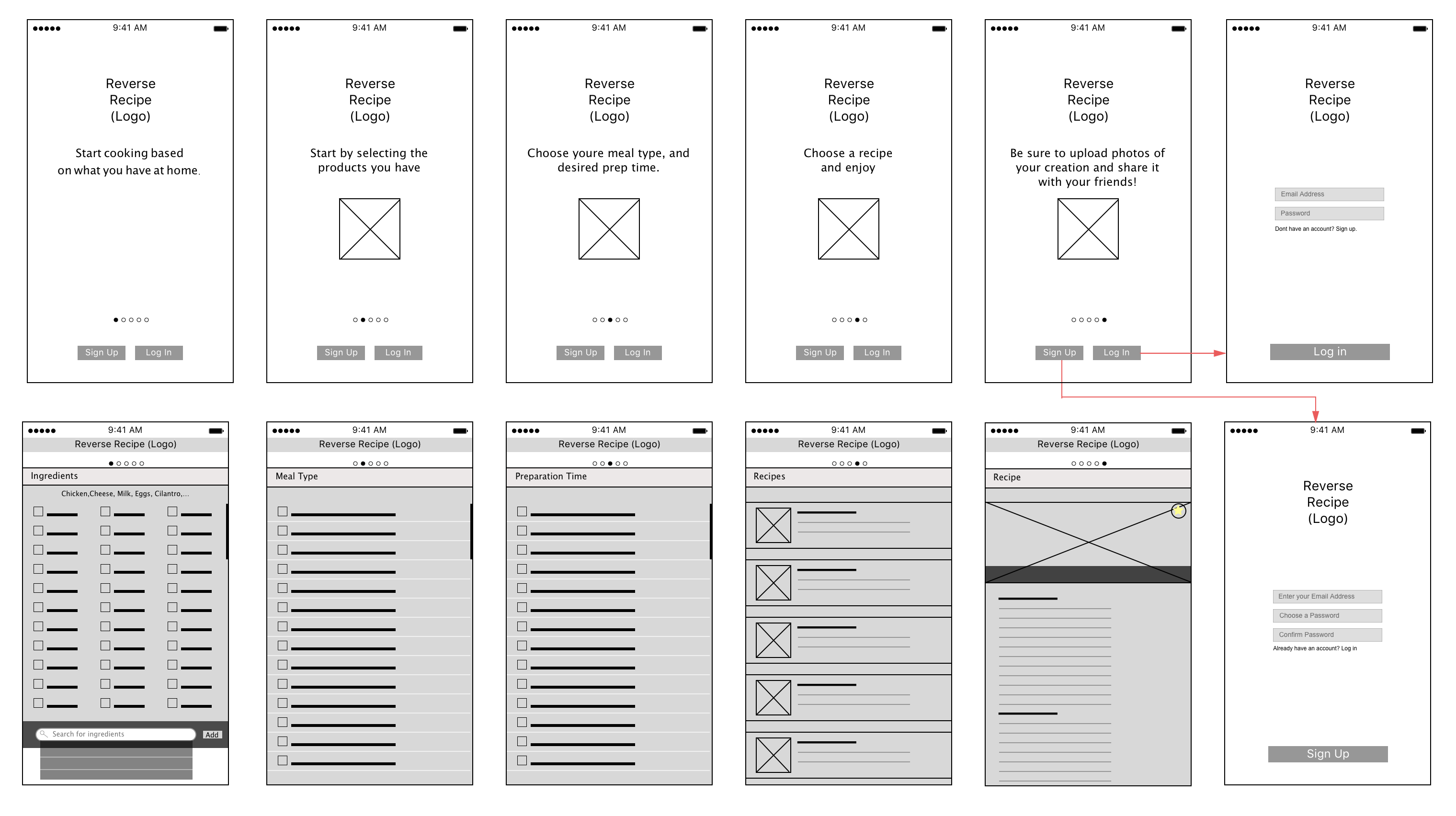